This article shares the context behind creating a custom map to visualize research center member locations. The project began when a client needed to replace their Google Maps-based solution with something more cost-effective and easier to maintain. Their manual process of updating location data was becoming unsustainable, especially since the Google Maps embedding service was incurring costs.
The challenge
The client faced several limitations with their existing approach:
- Their Google Maps implementation lacked the specific visualization features needed for their growing database of members
- Manually updating location markers was becoming time-consuming and error-prone When multiple members worked at the same institution, the map became cluttered with overlapping markers
- They needed to distinguish between different member types (faculty, students, collaborators) visually
- The solution needed to seamlessly integrate with their WordPress website
The main issue wasn’t necessarily that Google Maps was prohibitively expensive, but rather that the client wanted a more customizable solution that would give them complete control over their data and visualization techniques without potential usage constraints in the future.
The Solution
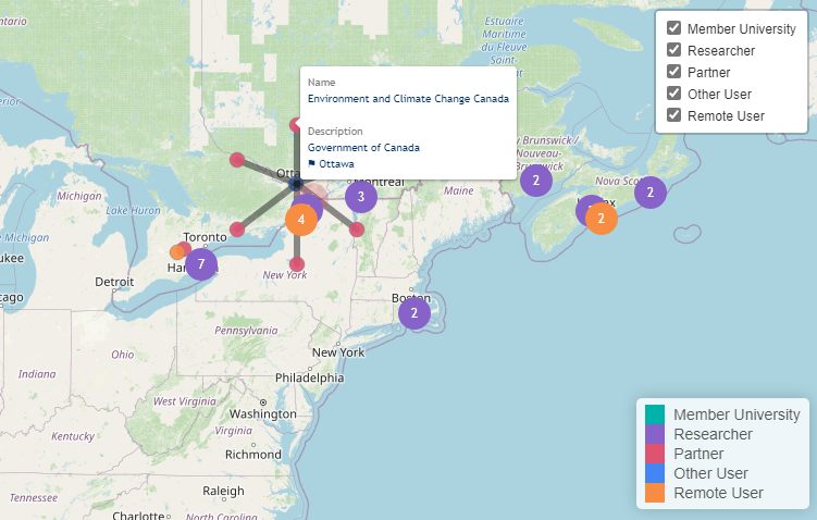
After evaluating several options, R with the leaflet mapping framework emerged as a good option. The open-source nature of these tools offered more customization possibilities. To handle the overlapping markers problem, we used the OverlappingMarkerSpiderfier in Leaflet - when clicking on a location with multiple members, the markers expand outward like a spider web, clearly revealing each individual.
Additionally, the map was made downloadable in a self-contained html page, which was then embedded into the website.
The workflow developed for the client looked like this:
flowchart LR
    A[CSV Data] --> B[R Shiny App]
    B --> C[Interactive Map]
    B --> D[Export Module]
    C --> E[Web Interface]
The client was particularly pleased with the “spider” feature that elegantly solved their overlapping markers problem. Another benefit was how the map revealed previously unnoticed patterns in their membership distribution - showing regional concentrations, category clusters, and international reach in ways that weren’t apparent from their database. Link to the map.
Where do our researchers come from? Check out our new interactive map! https://t.co/D5glRaTHuI@UVicScience @ubcscience @SFU_Science @ualbertaScience @UofC_Science
— Bamfield MSC (@BamfieldMSC) September 28, 2021
constructed by: @hamzaonde pic.twitter.com/hPc9ChceHD